Project 1
5C COVID Dashboard
A dashboard for COVID testing data that faculty relied on, that exposed official over-counting and that was awarded Best COVID Coverage of 2021 by the CA College Media Assoc.
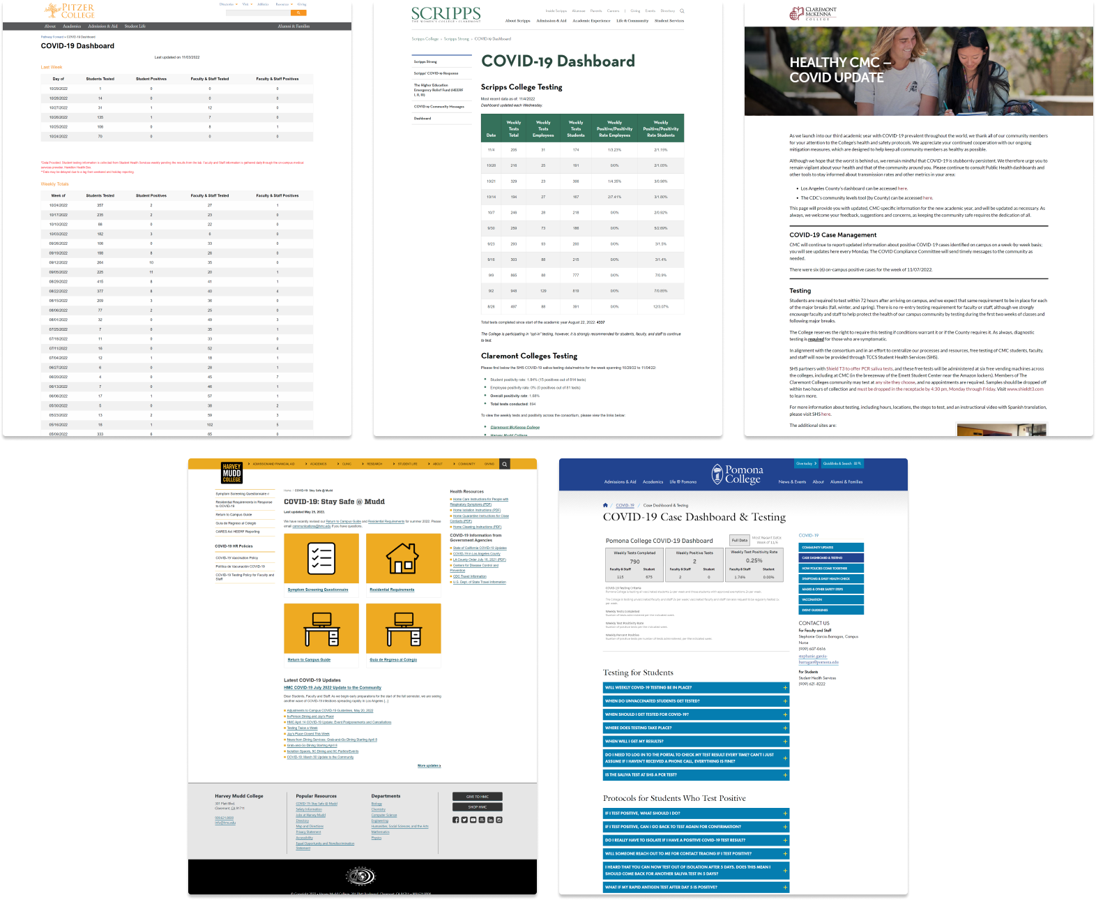
Where do Claremont Colleges community members turn for COVID information? Not official dashboards.
The five Claremont Colleges share a campus, and on average students cross-enroll for more than 40% of their classes.
Yet official COVID testing reporting is separated by school, with five websites displaying data at different frequencies and in different formats, making it difficult to get a sense of COVID risk on campus.
My work filled in the gaps to keep the community informed and safe.
In September 2021, I developed the 5C COVID dashboard, a single interface collecting up-to-date and historical testing data from the five Claremont Colleges. Initially created for students, soon faculty and staff told us that they relied on the dashboard to make decisions about COVID policy for their classes.
When I noticed inconsistencies in published COVID data, I developed a tool to take a screenshot of every school dashboard every day. The tool exposed multiple over-counting errors and led to a statement and correction from administrators.
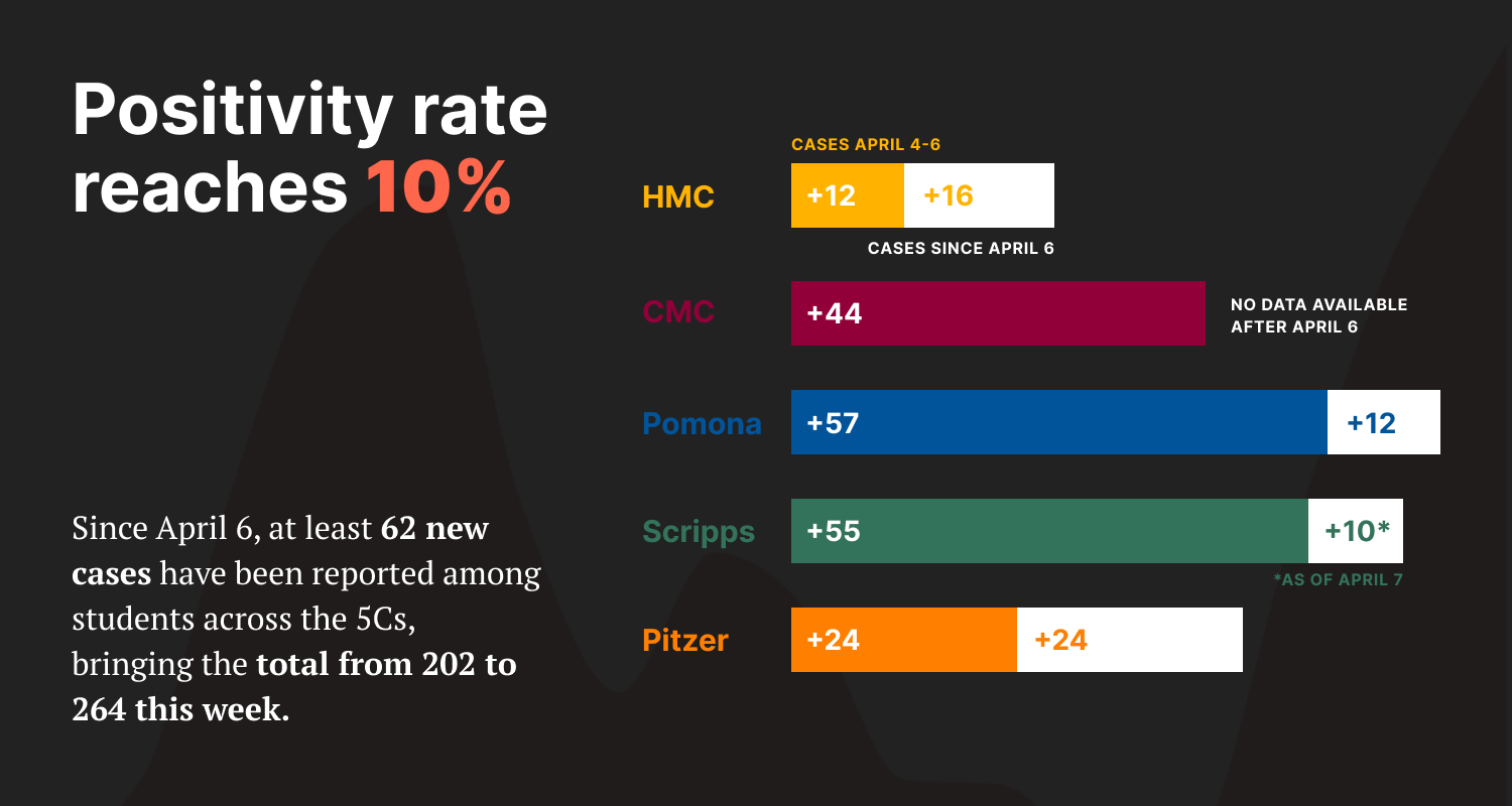
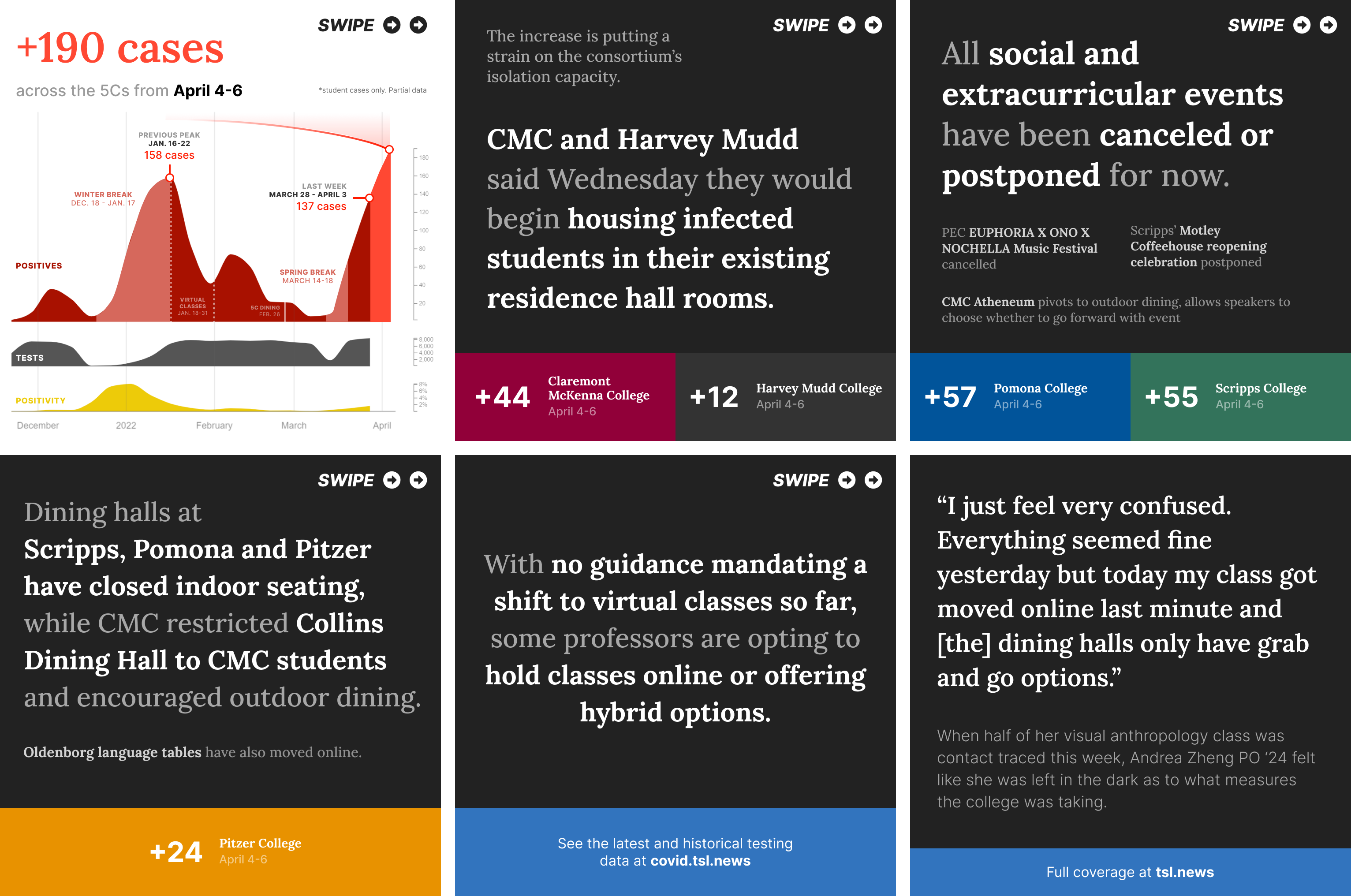
The dashboard also informed our coverage of campus COVID surges and policy changes. It was part of a package that was awarded Best COVID Coverage of 2021 by the California College Media Association.
 Back homeNext: Journalism’s influential awards lack diverse judges
You've read 0 of 4 scenarios.
Click through all four stories below to unlock my final message.